Psychology of Paint Colors in Interior Design
How Colors Communicate Emotion
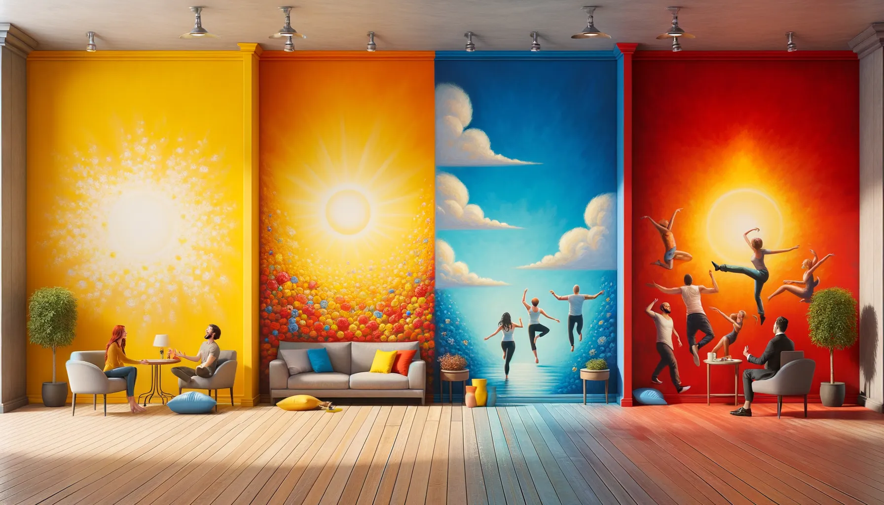
Imagine stepping into a fiery red room. Does your heart race a little? That’s no accident—color has the power to speak to us in whispers or shouts, all without saying a word. The psychology behind paint colors is nothing short of fascinating, and when it comes to interior design, it’s like cracking the code to human emotions.
Warm tones such as reds, oranges, and yellows can ignite passion, creativity, and coziness—but they can also feel overwhelming if overused. On the flip side, cool hues, like pale blues and greens, are like a breath of fresh air, calming the mind and easing stress. Ever noticed why hospitals tend to use soft green walls? It’s no coincidence; it promotes healing and peace.
- Gray: The ultimate neutral champion. It’s sophisticated but not bossy—a subtle backdrop that lets décor shine.
- Purple: Equal parts luxurious and mysterious, it’s perfect for spaces where you want a touch of drama.
Your home deserves a personality—a color-filled narrative that flows from room to room. Choosing wisely means creating spaces that don’t just look good but genuinely feel like home.
Popular Paint Colors and Their Effects on Mood
How Colors Stir Emotions
Have you ever walked into a room and instantly felt calmer, cozier, or even a little more energized? That’s the magic of paint colors at work! Each shade has its own personality and can subtly (or not-so-subtly) shape the mood of your space.
For instance, let’s talk about *blue*. A soft, powdery blue whispers serenity—perfect for a bedroom or office where focus and calm are needed. On the other hand, a bold navy makes a space feel confident and grounded, like a warm conversationalist at your dinner party.
Yellow, the color of sunlight and happy kitchens, radiates positivity. Soft buttery yellows feel friendly and welcoming, while brighter hues practically hum with creative energy. Careful though! Too much bright yellow can feel like an over-caffeinated morning where everything is just too much. Balance is key!
- Green: Nature’s neutral, bringing harmony and balance. Ideal for bathrooms or living rooms.
- Gray: Sleek, sophisticated, and dependable—a timeless choice for nearly any room.
- Red: Bold and passionate. Best as an accent color to avoid overstimulation.
Every hue tells a story—so, what story will your walls tell?
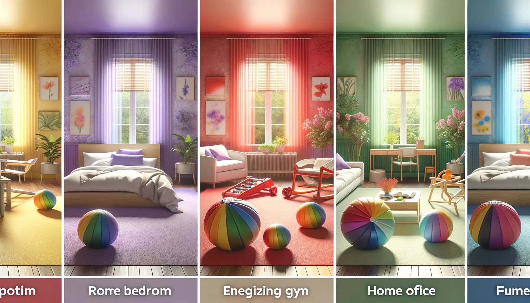
How Room Purpose Influences Color Selection
Why One Size Never Fits All in Paint Color Choices
Ever walked into a kitchen painted in deep navy and thought, “This feels… off”? The purpose of a room changes everything about its vibe! Every space in your home is like a character in a novel, and the paint color is its voice. Choosing the wrong “voice” might drown out the energy you’re trying to create.
For example, your living room might be where laughter bounces off the walls during family game nights or quiet conversations simmer over tea. Here, warm neutrals or soft greens encourage comfort and connection. But paint a bedroom in the same shade, and you could disrupt the serene cocoon we crave for rest.
Room Needs Dictate the Palette
When choosing colors:
- Kitchens: Energize with lively yellows or stimulate appetite with rich, earthy tones.
- Bathrooms: Refreshment rules—cool blues or pearly whites are go-to picks.
- Offices: Boost focus with shades like stormy grey or muted teal.
Think about how the room is lived in! A playroom demands fun, bold colors, while a dining room whispers for elegance through deep, moody hues. Every wall tells a story—make sure yours speaks the right language.
Tips for Choosing the Right Paint Color for Your Home
Finding Your Color Personality
Choosing the right paint color for your home is like picking an outfit that perfectly reflects your personality—it’s all about expressing who you are while creating a space that feels just right. Start by asking yourself: How do you want to feel when you walk into the room? Energetic and inspired? Cozy and calm? Maybe even a little dramatic? Your answers will guide your palette.
If you’re unsure, take a stroll through your wardrobe or favorite décor items. Notice any patterns? A love for soft blues in your clothing could translate to serene walls in your bedroom, while bold red accents might become the fiery feature wall in your dining room.
- Neutrals: Perfect for balance-seekers who love versatility.
- Pastels: Ideal for dreamers craving light and airy vibes.
- Jewel tones: A match made for glam enthusiasts who don’t shy away from richness.
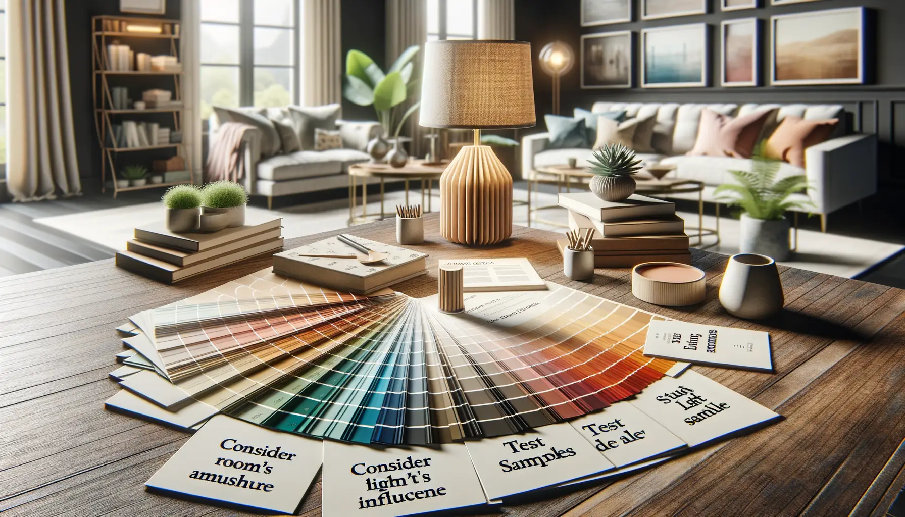
Test Before You Commit
Colors can be tricky—what looks stunning in the store may appear totally different at home. Always test! Grab a few sample pots, paint large swatches directly on your walls, and observe them throughout the day. Morning sunlight may turn your perfect beige pinkish, while evening shadows might make your cheery yellow look… well, green!
Mistakes to Avoid When Picking Paint Colors
When the Color Wheel Spins Out of Control
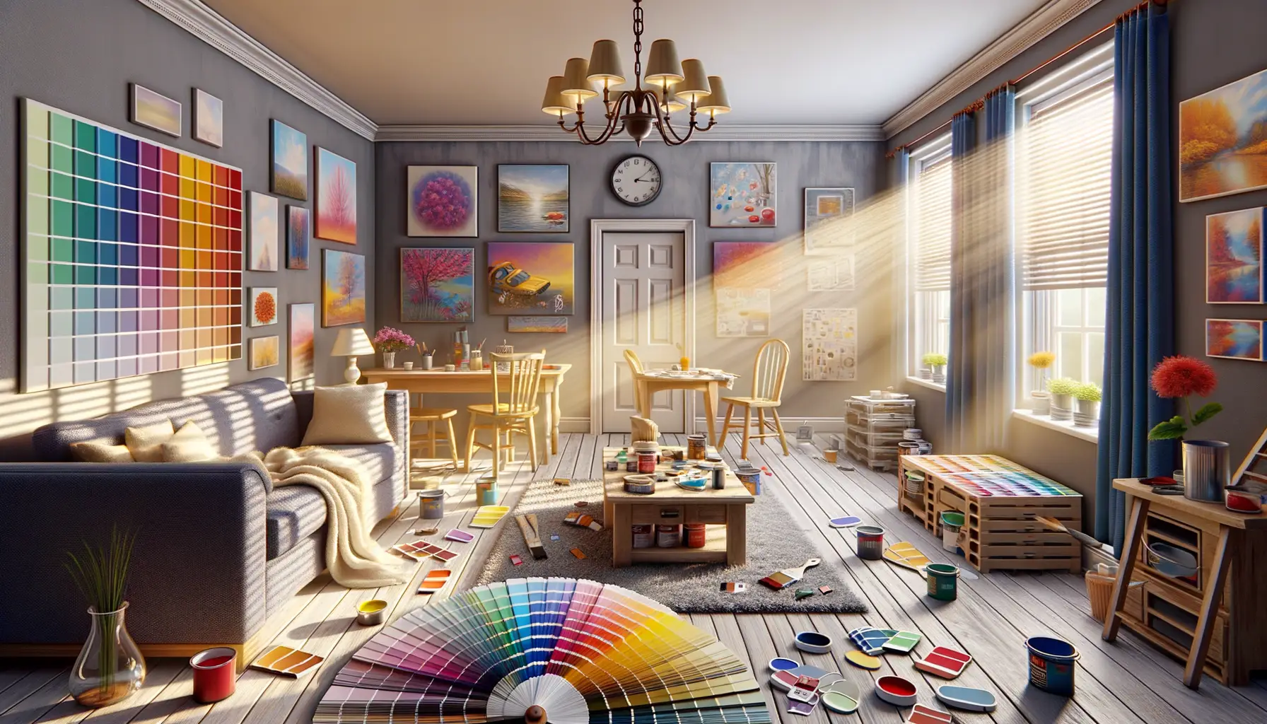
Picture this: you’ve found the perfect couch, the ideal curtains—and then you paint the walls a color that completely clashes. It happens more often than you think! One common mistake people make is picking a paint color *too quickly.* Standing in the store under harsh fluorescent lighting and saying “this one will do” is a recipe for regret. Paint looks entirely different under your home’s natural light.
Sample sizes exist for a reason! Always grab a few samples and test them on your walls before committing. And don’t just slap them up in the middle of the day. Look at how they appear in the morning glow, at high noon, and when your cozy lamp comes on at night. Trust me, it’s worth the effort to avoid a major repaint later.
The Trap of Trends
While that deep charcoal or neon pink might be the rage on Instagram, remember: you’re the one living with it. Trends fade, but your walls? They’ll stick around. Instead of blindly following the crowd, ask yourself: does this color match my personality, furniture, and overall vibe? And be wary of overly bold statements. There’s a fine line between daring and “what was I thinking?”
- Avoid ignoring undertones—colors like pale gray can secretly carry blue or purple hues.
- Don’t forget to consider the size of the room; dark colors can shrink spaces.
- Steer clear of testing just one option. A single swatch rarely tells the full story!
Lastly, remember: paint is personal. It’s the backdrop of your life, not just a fleeting decision. Choose wisely!